We live in an age dominated by digital technology. Multimedia is multiplying. In the Western world at least, we are constantly bombarded by images, video, audio, text, information. It can be exilherating, inspiring, motivating and also bewildering at times. So if this is our modern-day reality, it would be a good idea to explore what exactly goes into a few examples of these multimedia websites and products. It is a fascinating and expansive topic, with pros and cons, so let’s dive right in. I'm going to go over three different multimedia websites, and analyse them from a multimedia perspective.
This website is predominantly factual and service orientated. It uses photos, graphics, typography and text. There don’t seem to be any video or audio, or perhaps some have eluded me. The purpose of their multimedia is to inform the public of services and medical information. There is a blog which provides a wide range of articles on this theme too. There are also hyperlinks which take you to relevant pages where you can book appointments. It seems straightforward and user-friendly. It allows people to educate themselves on medical and health aspects. It is interesting to note what emotions come up whilst navigating the site. To me it seems rather cold and bland, but if someone is experiencing health issues and is perhaps in a panic, they would want the health site to be practical and easy to read and navigate, which I do think this satisfies. Interestingly, there is a dominant use of the colours blue and yellow.

Blue and yellow are both primary colours and the psychology behind these colours is interesting to note. Blue evokes trust, calmness and dependability. It is mentally soothing and reassuring. All appropriate qualities for a health website. It is widely used though, it seems, also by other types of businesses, such as Barclays, Merrill Lynch, IBM, HP and Dell. Yellow evokes joy, happiness, optimism, It has a long wavelength and has the most powerful impact psychologically of all the colours. It is the first colour infants can pick up on, so it is certainly a good colour to use to grab people’s attention. It lifts spirits and inspires confidence, which is appropriate to a health website if people are worried. It is important, I feel, to be conscious of the dominant use of these two colours so we are aware of the psychological impact this has on us as perhaps calming may not always be the wisest course of action and feeling superficial elation when things are more concerning than may appear on the surface may also present concern. Anything that affects our thoughts and feelings will ultimately influence our behaviour too, so knowledge and awareness is important.
The Guardian Newspaper website
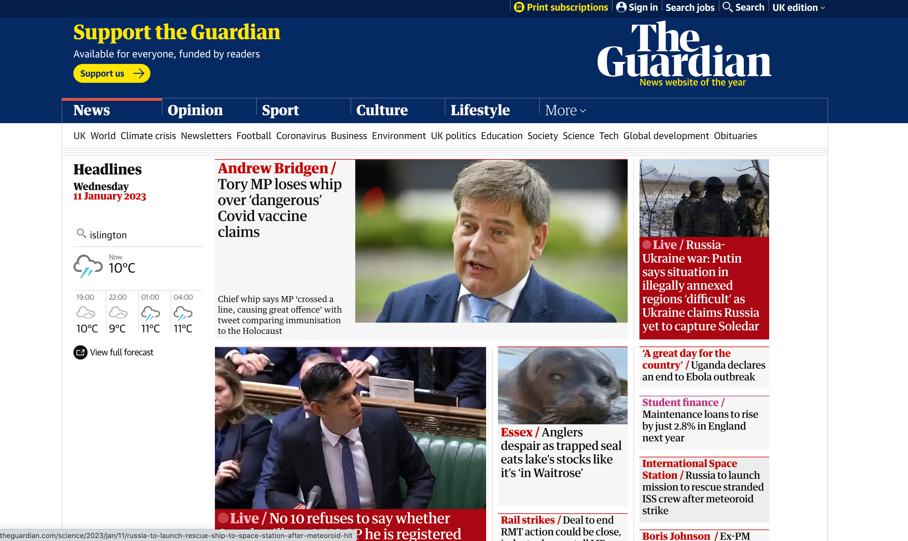
This website uses pretty much all the different types of multimedia - video, photos, graphics, animation, typography and text, and sound. The website is very busy, with lots of information presented in many different ways all on the same page. It has a clear structure, however, and a mix of typography, making it easy on the eyes but retaining the classic feel of this newspaper, even if now predominantly online. The purpose of this website is to inform people on certain, reported happenings around the world. Like any news outlet it has to be selective in what it presents. Looking at the website I am aware of the feelings arising in me, which are discomfort and worry. The news items are all worrying and concerning. Lots of trouble and strife, conflict and worry. I don’t notice many positive news items, which is interesting. There are certainly positive things happening in every moment, but they don’t get reported on very much, I suppose because bad news sells more and makes people want to come back for more updates in the hope one day of finding peaceful resolution and a brighter future. Interesting to note that this website also uses a lot of yellow and blue, I suppose for the same reason as for the first website, although perhaps the blue here is more to create a sensation of trustworthiness. News is such a dominant aspect of our lives nowadays and seems to dictate what reality is.
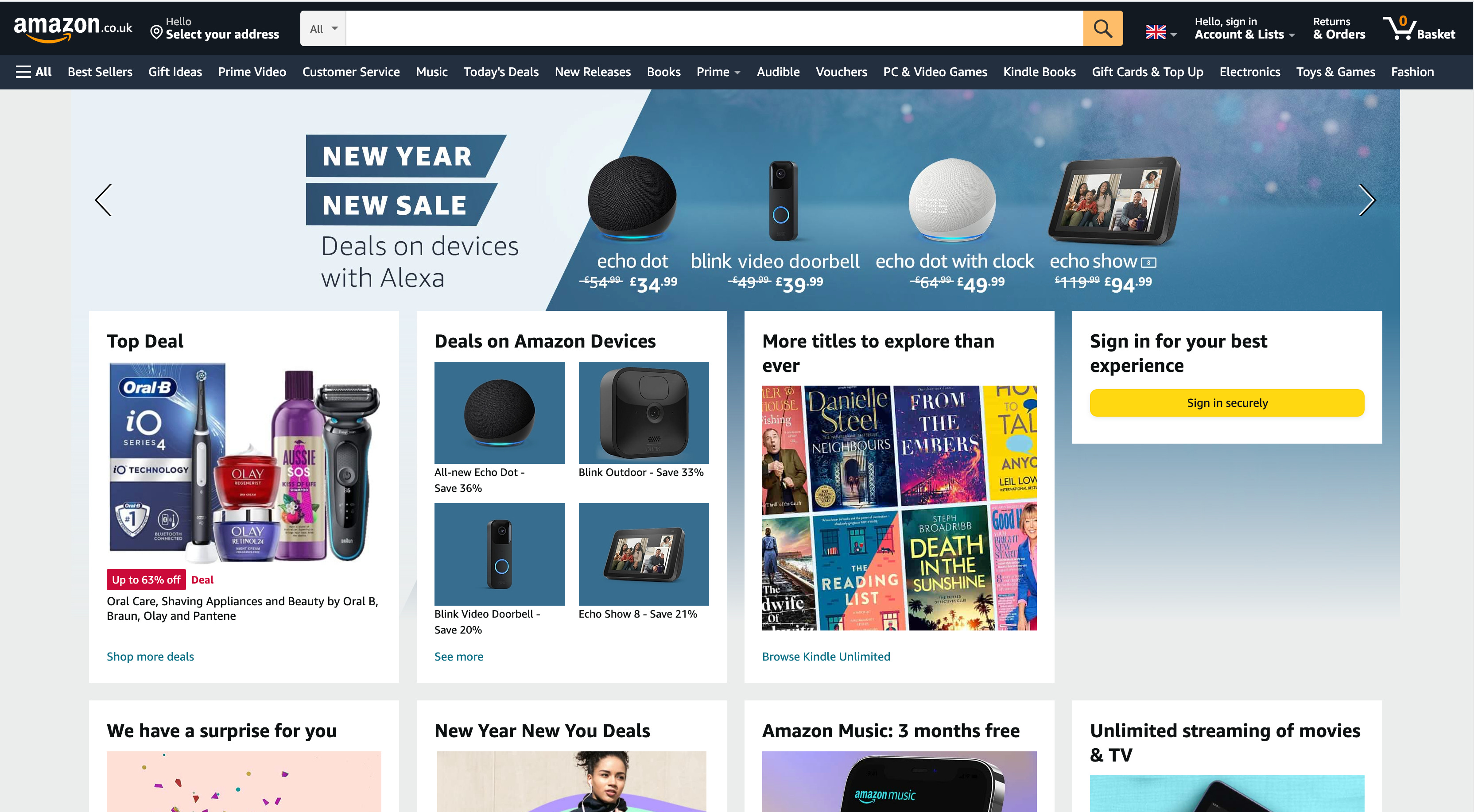
The third and final website I am exploring in this article is Amazon. This uses many of the different types of media, perhaps excluding animation. If we include Amazon Prime, then that uses everything, including video and animation in the programmes and films on offer. On the homepage we can see a lot of text and images. The typography is sans serif and very easy on the eye. It certainly does a great job of making a lot of information appear easier to take in and digest. Again, blue is used and some yellow, interestingly, but of course there is a lot of colour in general in the products it chooses to present to us. Special offers and deals are written in white on a bold red background, which makes it stand out and grabs our attention. Psychologically red is connected with strong emotions, such as desire, love, passion and anger. Are these emotions which make us spend more? I personally feel a little overwhelmed with the amount of choice available on this amazon website, but I can also feel excitement at the prospect of finding exactly what I need and probably at a good price too. How many times have you found yourself on amazon looking for one specific thing and you end up buying other products too? And sometimes the ones they suggest, which are often clever suggestions, are the ones you end up choosing, very clever marketing on their part for those profiting from our well-earned pennies.

This screenshot shows a part of the website with links to the Launchpad. I’m not entirely sure what this is but I noticed my gaze shone here immediately as I was drawn in by the bold colours. They are rather garish and unreal, or surreal even, but there is certainly something exciting about them. Something tells me that the reality of someone working in an Amazon warehouse is not surrounded by bright colours and excitement. Scandals of working conditions in the Amazon business have come out on various news outlets over the years and there surely is a reason why we can receive the products we buy so quickly! Do the workers even get proper breaks, let alone proper pay? There is a price for everything, hence why I personally have chosen to stop purchasing from Amazon, unless it is something I can’t find anywhere else. But writing this article is fascinating because I can feel myself being enticed by the layout, colours, images even though my rational mind is trying to tell me to stay away, that I’ve made a conscious decision to spend my money in small shops with local traders where at all possible.
In conclusion, it has been an interesting experience to analyse these websites and to really ask myself how I feel, what I see and might it have an effect on my behaviour. This exercise has also introduced me to the concept that there does seem to be specific thought put into the choice of font, layout and colour, among other details. If large corporations can use it, then why not small, independent traders and freelancers?